
Mobile product pages: make ordering easier
Test at the small screen sizes your customers use.
Test at the small screen sizes your customers use.
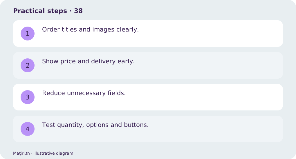
Practical steps
- Order titles and images clearly.
- Show price and delivery early.
- Reduce unnecessary fields.
- Test quantity, options and buttons.
Worked example
Check widths of 320 and 390 pixels for readable pricing, complete text and buttons within the screen.
Mistake to avoid
Do not hide essential information in an extremely long image.
Working checklist
Open the page as someone seeing the product for the first time. Can they understand what is included, colour, size and total payment? Place missing information near the decision and organise details into short sections. Check text and images on mobile after saving: higher resolution cannot make tiny text inside an image readable.
Common question
Is desktop testing enough?
No: test touch, keyboard and error handling on phones.
Put it into practice
Create your store on Matjri, prepare the information needed for this guide and test the result as a customer on your phone before sharing the link. Edit photos, descriptions and options and manage orders from your store dashboard.
Sources and further reading
Editorial review: 11 October 2026. Calculations are illustrative; tools and fees may vary by account and supplier.